With the Web becoming increasingly ubiquitous and more devices, screen dimensions, and contexts to design for, what is the best way forward for mobile web design? Let’s explore two strategies for UX designers that we often recommend: responsive web design (RWD) and adaptive web design (AWD, or mobile websites). Though adopted widely by agencies across the globe, RWD is not the panacea when designing websites that need to work across all of these mediums. Conversely, going with ‘pure’ AWD is rarely ideal by itself. Often, the best solution is a combination of both approaches.
Combining RWD with AWD
The best solution is often achieved by combining RWD with AWD, so that you enjoy the cost and time efficiencies of RWD while offering the better user mobile experience that AWD offers in prioritized content areas. Below, we see an example of this from 1997defender.com where the ‘break point’ morphs into an entirely different layout for smartphone users.
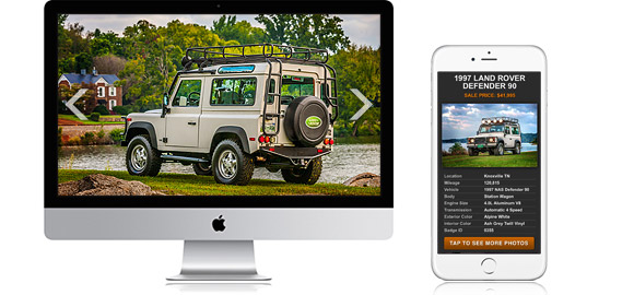
Using RWD as the basis, you can include some elements of AWD, changing some assets, content, or interfaces depending on whether the site is visited from a smartphone, tablet, or desktop—thus making a responsive website appear ‘adaptive’. Similarly, if you go with the AWD approach you can embrace RWD’s responsiveness so the content and interfaces degrade gracefully on different size screens (RWD) until the ‘break point’ where a different version is applied (AWD). In this example, the tablet version would look similar on a 10” iPad to on a 7” Galaxy tab but when it reached a mobile size 5” it would morph into the smartphone version.
Rather than looking at your mobile needs in isolation, we take a step back to assess your web requirements across both channels to ensure that you are offering a consistent and coherent experience to the end user. By combining RWD and AWD, you can often obtain the same user experience objectives far more cost effectively and efficiently than by using AWD or RWD alone.