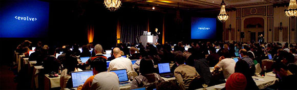
It's always refreshing to attend a design conference. A chance to let your mind be free of day to day production. At the beginning of October 2013, Matt attended An Event Apart in Austin, Texas. It was an intense three-day session for web designers and developers. Twelve guest speakers talk code, content and usability; covering best practices for desktop, tablet and mobile design.
I found that it felt good to be lost in the right direction. Web design is constantly changing with the introduction of new platforms. Out with the old, in with the new, right? Well, not always. Experience is a powerful asset, even in a cutting-edge and evolving industry like web design. It’s not enough to attend a lecture (or twelve). Experience comes with being presented with a problem and coming up with unique solutions.
But there is one aspect of web design that will always remain constant, change. It’s part of my job to be constantly learning about new ways to improve the way I build the web. It goes beyond the daily grind of pushing pixels and writing code. The outside knowledge and inspiration I gained in Austin is today being applied to what we do on our client projects.
The following are my favorite takeaways from the conference.
1. Users might only view your website on a mobile device. Is your mobile experience a good one? A mobile website should be seen as less of a luxury, and as more of a necessity.
2. The importance of content first, navigation second. The focus should be getting the information to the user with fewer mouse clicks.
3. Basic content and functionality should be accessible to all web browsers. Styles are written to enhance the page as users gain functionality (aka: Progressive Enhancement).
4. Presenting a client style tiles can be a more efficient way of showing initial concepts to clients. Much like an interior designer, you can show clients the colors, fonts and buttons before spending hours on pixel perfect layouts.