Logo Rebranding
Tennessee National had a number of challenges that we were able to overcome with the rebranding of the community and a revised advertising and public relations program. I teamed up with Jeff Hooper at Ackermann PR, to redesign their existing collateral and communications in order to gain exposure in existing and new target markets.
Strategy & Concept
The first step was examining Tennessee National’s current logo and assessing whether they properly reflected the mission of the development. We determined very quickly that the brand had become outdated, and no longer represented the quality of Tennessee National’s master-planned private waterfront and golf community.
Design Exercise
We met with the Board of Tennessee National so that we could benefit from their ideas, expertise, and passion for the development. Then, as a task force, we used this input, along with our own, to guide me as the Art Director to come up with logo and tagline options. Ackermann PR reviewed my various design options, selected our single top pick, and presented it to the Board. In this case, the paradox of choice worked in our favor as the Board unanimously agreed with our decision.
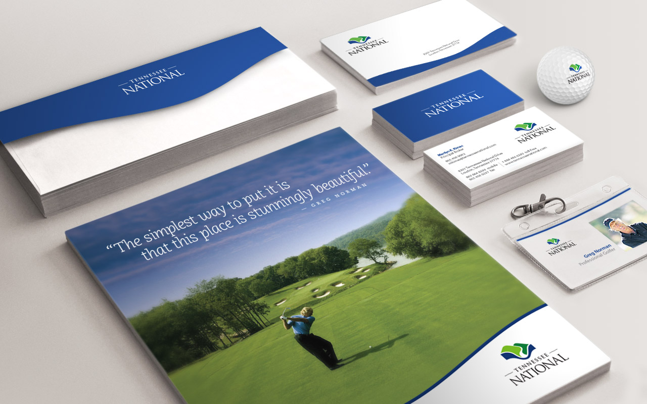
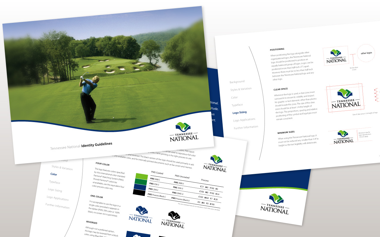
Style Guide, Stationary & Signage
I created a brand style guide, with Tennessee National's new logo, to form and maintain all of those various elements that, when combined, spell out the entire brand as it's recognized. After designing business cards, envelopes, mail labels and note cards for marketing usage, the new logo started being applied to onsite signage and pro shop sale items.